Examples
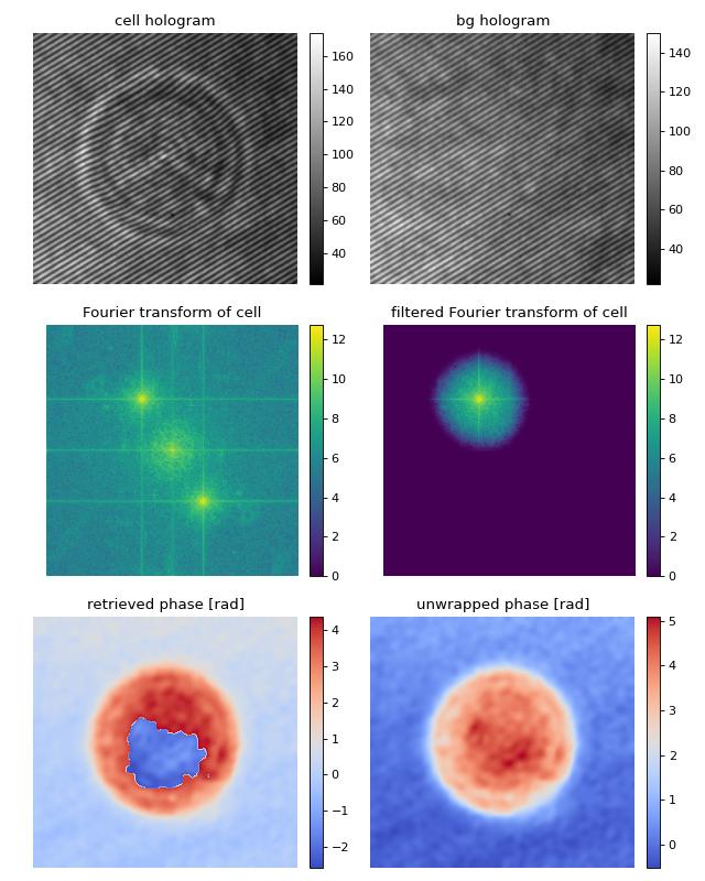
Digital hologram of a single cell
This example illustrates how qpretrieve can be used to analyze digital holograms. The hologram of a single myeloid leukemia cell (HL60) was recorded using off-axis digital holographic microscopy (DHM). Because the phase-retrieval method used in DHM is based on the discrete Fourier transform, there always is a residual background phase tilt which must be removed for further image analysis. The setup used for recording these data is described in reference [SSM+15].
Note that the fringe pattern in this particular example is over-sampled in real space, which is why the sidebands are not properly separated in Fourier space. Thus, the filter in Fourier space is very small which results in a very low effective resolution in the reconstructed phase.
 1import matplotlib.pylab as plt
 2import numpy as np
 3import qpretrieve
 4from skimage.restoration import unwrap_phase
 5
 6# load the experimental data
 7edata = np.load("./data/hologram_cell.npz")
 8
 9holo = qpretrieve.OffAxisHologram(data=edata["data"])
10holo.run_pipeline(
11    # For this hologram, the "smooth disk"
12    # filter yields the best trade-off
13    # between interference from the central
14    # band and image resolution.
15    filter_name="smooth disk",
16    # Set the filter size to half the distance
17    # between the central band and the sideband.
18    filter_size=1/2)
19bg = qpretrieve.OffAxisHologram(data=edata["bg_data"])
20bg.process_like(holo)
21
22phase = holo.phase - bg.phase
23
24# plot the intermediate steps of the analysis pipeline
25fig = plt.figure(figsize=(8, 10))
26
27ax1 = plt.subplot(321, title="cell hologram")
28map1 = ax1.imshow(edata["data"], interpolation="bicubic", cmap="gray")
29plt.colorbar(map1, ax=ax1, fraction=.046, pad=0.04)
30
31ax2 = plt.subplot(322, title="bg hologram")
32map2 = ax2.imshow(edata["bg_data"], interpolation="bicubic", cmap="gray")
33plt.colorbar(map2, ax=ax2, fraction=.046, pad=0.04)
34
35ax3 = plt.subplot(323, title="Fourier transform of cell")
36map3 = ax3.imshow(np.log(1 + np.abs(holo.fft_origin)), cmap="viridis")
37plt.colorbar(map3, ax=ax3, fraction=.046, pad=0.04)
38
39ax4 = plt.subplot(324, title="filtered Fourier transform of cell")
40map4 = ax4.imshow(np.log(1 + np.abs(holo.fft_filtered)), cmap="viridis")
41plt.colorbar(map4, ax=ax4, fraction=.046, pad=0.04)
42
43ax5 = plt.subplot(325, title="retrieved phase [rad]")
44map5 = ax5.imshow(phase, cmap="coolwarm")
45plt.colorbar(map5, ax=ax5, fraction=.046, pad=0.04)
46
47ax6 = plt.subplot(326, title="unwrapped phase [rad]")
48map6 = ax6.imshow(unwrap_phase(phase), cmap="coolwarm")
49plt.colorbar(map6, ax=ax6, fraction=.046, pad=0.04)
50
51# disable axes
52[ax.axis("off") for ax in [ax1, ax2, ax3, ax4, ax5, ax6]]
53
54plt.tight_layout()
55plt.show()
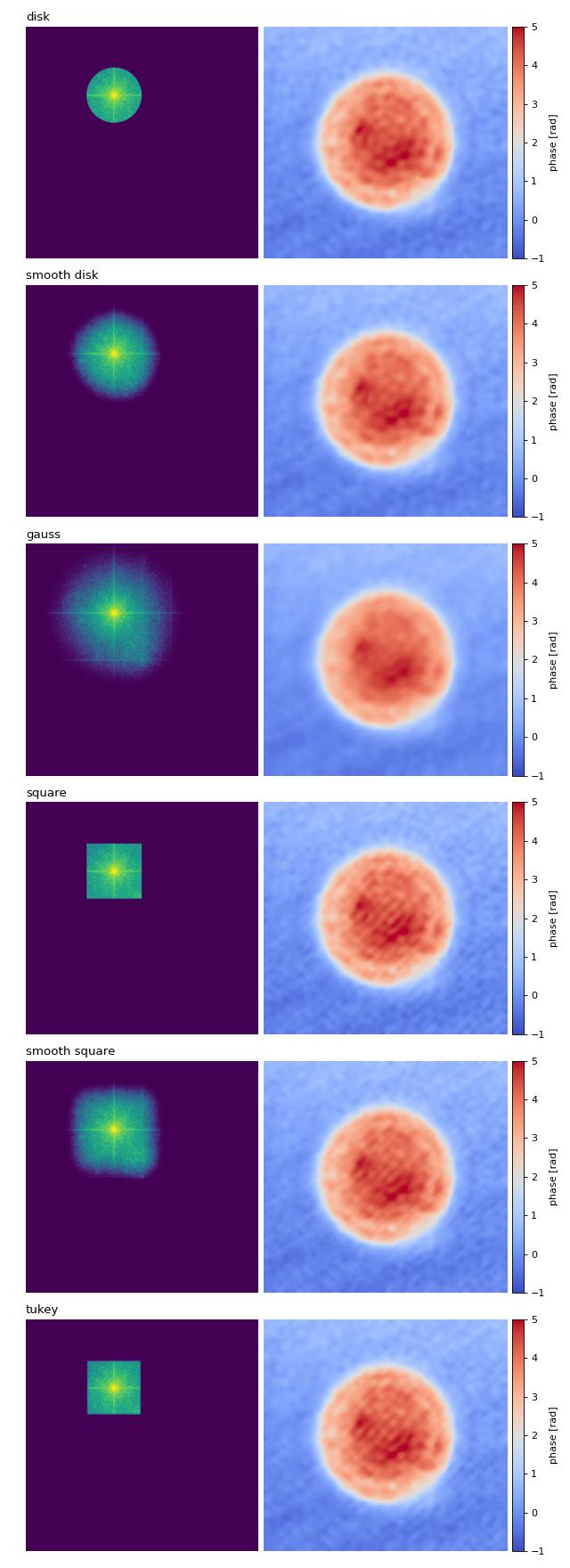
Filter visualization
This example visualizes the different Fourier filtering masks available in qpretrieve.
 1import matplotlib.pylab as plt
 2import numpy as np
 3import qpretrieve
 4from skimage.restoration import unwrap_phase
 5
 6# load the experimental data
 7edata = np.load("./data/hologram_cell.npz")
 8
 9prange = (-1, 5)
10frange = (0, 12)
11
12results = {}
13
14for fn in qpretrieve.filter.available_filters:
15    holo = qpretrieve.OffAxisHologram(data=edata["data"])
16    holo.run_pipeline(
17        filter_name=fn,
18        # Set the filter size to half the distance
19        # between the central band and the sideband.
20        filter_size=1/2)
21    bg = qpretrieve.OffAxisHologram(data=edata["bg_data"])
22    bg.process_like(holo)
23    phase = unwrap_phase(holo.phase - bg.phase)
24    mask = np.log(1 + np.abs(holo.fft_filtered))
25    results[fn] = mask, phase
26
27num_filters = len(results)
28
29# plot the properties of `qpi`
30fig = plt.figure(figsize=(8, 22))
31
32for row, name in enumerate(results):
33    ax1 = plt.subplot(num_filters, 2, 2*row+1)
34    ax1.set_title(name, loc="left")
35    ax1.imshow(results[name][0], vmin=frange[0], vmax=frange[1])
36
37    ax2 = plt.subplot(num_filters, 2, 2*row+2)
38    map2 = ax2.imshow(results[name][1], cmap="coolwarm",
39                      vmin=prange[0], vmax=prange[1])
40    plt.colorbar(map2, ax=ax2, fraction=.046, pad=0.02, label="phase [rad]")
41
42    ax1.axis("off")
43    ax2.axis("off")
44
45plt.tight_layout()
46plt.show()